

A Neo-Georgian Glow-Up in Toorak

Neo-georgian drab get’s a fresh, sophisticated glow up.
The 1990s called… and they desperately want their house back. This Toorak townhouse, trapped in a time capsule of neo-Georgian fatigue—think overworked columns, heavy-handed detailing, and a little too much Dulux “low fat cheese single” beige—is long overdue for a shake-up. But instead of waging war against its classical roots, this reinvention leans in, embracing the home’s original DNA while injecting it with a fresh, contemporary perspective. Enter: contemporary classic minimalism. (Yes, that’s a thing… well, now it is anyway.) By blending high-quality materials, a refined monochromatic palette, and a balance of old-world charm with sleek modern design, this home is about to catapulted into the 21st century—without losing the best bits of its past. Becasue hey, the 90’s weren’t all bad…I think. Who can remember. If you survived the raving golden age you know exactly what I mean.

The Grand Entrance & Living Room: Moody Meets Monochrome
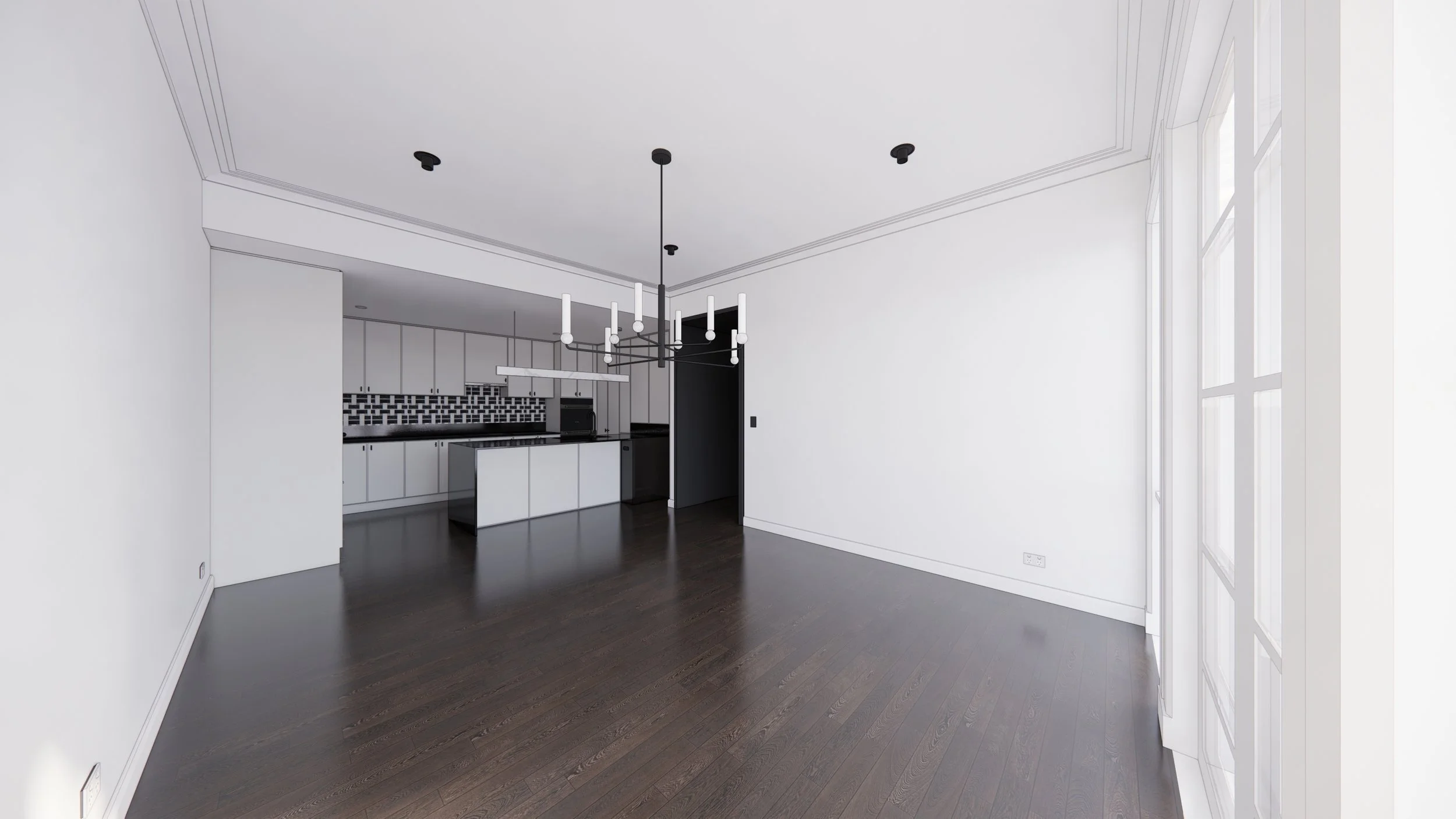
Step through the doors, and you’re immediately greeted by a carefully curated blend of old-world charm and crisp, modern refinement. Gone are the days of tired finishes and outdated detailing. Now, the space is all about contrast and texture—refinished Japan black floorboards add depth, while fresh Dulux Lexicon Quarter walls bring a bright, sophisticated crispness.
The living area is anchored by a brand-new marble fireplace, turning what was once a tired plain wall just trying to get by into a sculptural statement. But the real magic happens in the transition between spaces—specifically, the one we’ve affectionately dubbed The Tunnel of Love.
The Tunnel of Love: A Passageway Worth Swooning Over
If you think a hallway is just a hallway, think again. This one is a full-blown experience. Clad in rich, dark grain veneer by Navurban, this moody passageway isn’t just about aesthetics—it’s a lifestyle, seamlessly disguising the transition between the home’s original hardwood floors and the brand-new timber flooring replacing the (honestly, hideous) carpet in the living room. To tie it all together, a marble floor insert subtly marks the shift, creating a moment of quiet luxury that feels as intentional as it is striking. Chuck in some pinhole overhead lighting and just try to resist.
It’s a rare thing for a utilitarian thoroughfare to steal the show, but this one? It demands, no wait. It commands you attention and undying worship.
Dining & Kitchen: Sophisticated With a Side of Drama
Emerging, flushed with excitement from the Tunnel of Love, you step into the kitchen and dining area—spaces that have been designed to feel both elevated and effortlessly functional. The dining room channels restaurant-inspired luxury, blending monochromatic elements with rich textures. Gold velvet dining chairs sitting atop a moody but rich navy silk rug inject just the right amount of warmth and glamour.
Then there’s the kitchen—a masterclass in balance. Instead of gutting everything and starting fresh, the design works with what’s already there, enhancing and refining the existing elements. Pre-finished satin grey doors and panels bring a soft, modern feel, while new Greg Natale marble tiles seamlessly integrate with the home’s original black Caesarstone benchtops. The result? A space that feels bespoke and high-end without the need for a complete overhaul.

Upstairs: A Sanctuary in the Making
Heading upstairs, the transformation continues. The two smaller bedrooms and main bathroom get a refined upgrade—nothing overly flashy, just smart, elegant choices that make all the difference. But the real star of the upper floor? The master suite.
This isn’t just a bedroom; it’s a full-on retreat, designed to bring five-star hotel luxury into everyday living. Layers of plush high-pile carpet, rich dark sea-grass wallpaper, and bronze accents create a space that’s moody, intimate, and painfully chic. A four-poster bed sits at the center, framed by stingray friendly faux shagreen bedside tables with antique brass trim—because sometimes, a little extra drama is exactly what a room needs.
And then there’s the ensuite—where the design takes bespoke hotel-esque luxury to new heights. Think black steel framing, reeded glass panels, and crisp white Carrara marble, all coming together in a space that’s both timeless and bold. A chevron marble tile floor adds an extra touch of artistry, reinforcing that no detail has been left to chance.

Inspired by the best hotel bathrooms, the master ensuite delivers glamour in spades.
Powder Room: A Small Space With a Big Attitude
If the powder room was a person, it would be the effortlessly cool one at the party— slightly mysterious, and impossible to ignore. Dark navy seagrass wallpapered walls create a moody, textural moment. A bold, monochrome chevron marble floor ties it all together, making this small space feel as grand as the rest of the home.
Because let’s be real—if a powder room doesn’t make a statement, is it even worth having?
The Verdict: A Neo-Classical Reinvention Done Right
This Toorak townhouse isn’t just a renovation—it’s a reimagining. By embracing its neo-Georgian roots rather than fighting them, this project proves that classical details and contemporary minimalism can (and should) coexist beautifully. The result? A home that feels bold yet timeless, sophisticated yet inviting, and every bit as breathtaking as it deserves to be.
Welcome to the next era of neo-neo-classical living.
Dave xx


Colour Drenching: Because More is More (And It’s Glorious)
Colour drenching is the interior design equivalent of diving headfirst into a giant tin of paint. Instead of playing it safe with a feature wall, this trend takes one colour—walls, ceilings, doors, trims, the whole shebang—and absolutely soaks your space in it. The result? A beautifully immersive, cohesive, and effortlessly chic vibe that makes a statement without trying too hard (kind of like that friend who ‘woke up like this’ but you know has a 12-step skincare routine).

You know those moments in life when you think, "Go big or go home"? Like when you commit to bottomless brunch and immediately regret that last mimosa (but still order another…or worse, someone yells “let’s do shots!”)? That’s colour drenching in a nutshell—except instead of regret, you get a visually stunning, mood-boosting masterpiece of a room.
So, What Exactly Is Colour Drenching?
Glad you asked! Colour drenching is the interior design equivalent of diving headfirst into a giant tin of paint and deciding, "Yep, this is my life now." Instead of playing it safe with a feature wall (a hard no from me anyways), this trend takes one colour—walls, ceilings, doors, trims, the whole shebang—and absolutely soaks your space in it. The result? A beautifully immersive, cohesive, and effortlessly chic vibe that makes a statement without trying too hard (kind of like that friend who ‘woke up like this’ but you know has a 12-step skincare routine).
Why It’s So Damn Good
First off, colour drenching is the lazy person's dream (hi, it’s me). If you've ever spent hours agonising over which shade of white is the ‘right’ white (spoiler: it’s a trap, they all look different in every light), then you'll love this trend. One colour means fewer decisions, and fewer decisions mean less stress—which means more time for the things that matter. Like wine. Or aggressively fluffing your throw pillows…actually on the last point, the design illuminati says we shouldn’t be chopping cushions anymore FYI. #Devastated.
What It Does Visually

Besides making your space look like it belongs in a ridiculously high-end design magazine, colour drenching has this magical ability to make a room feel bigger, cosier, and just cooler. When everything is the same hue, it blurs the edges of the space, making walls seem taller, ceilings higher, and doorways disappear into the background like an architectural magic trick. It’s the design equivalent of soft focus on a dating app photo—everything just looks better.
Other General Benefits (Because Who Doesn’t Love a Perk?)
Creates Mood & Drama: Whether you want to go deep and moody (hello, rich forest greens) or light and airy (soft peach, anyone?), drenching your space in colour gives it serious personality.
Works in Any Room: Bedrooms? Yes. Bathrooms? Absolutely. Tiny, weird nooks you don’t know what to do with? THE best.
Disguises Ugly Bits: Got a door or some weird architectural quirk you’d rather not highlight? Colour drenching camouflages it like a pro.
Minimalist-Friendly (Kinda): If you love the idea of minimalism but also really love colour, this is your loophole. One bold shade = maximum impact with minimal effort. Winning.
But Have I Managed to Convince a Client Yet? Absolutely Not.
Look, I’d love to say my clients are lining up to embrace the transformative magic of colour drenching, but the reality? Australians, by and large, are a conservative bunch when it comes to colour. The idea of painting a ceiling anything other than ceiling white sends people into an existential crisis. I’ve seen less panic at a snake sighting (and we live in Australia, so that’s saying something).
I’ve tried it all—mood boards, Pinterest inspo, passionate TED Talk-style monologues about the joys of a fully immersive space. Still, the second I suggest that a ceiling could, in fact, be a colour, I watch my clients' pupils dilate in pure terror. "Isn’t that… a bit much?" they whisper, clutching their Dulux Natural White swatches like a security blanket.
One day, though. One day, I’ll convert the masses. Until then, I’ll keep fighting the good fight, armed with a paintbrush and a dream.
So there you have it, friends. Colour drenching: because sometimes, more is actually more, and in the best possible way. Now go forth and paint your world fabulous. Just maybe don’t start with your partner’s home office unless you want a domestic-level debate on the emotional impact of deep aubergine.
Happy decorating, legends! #ColourDrenching #GoBoldOrGoHome
Dave xx

Future Nostalgia: Transforming a Tired Family Home into a Sophisticated Sanctuary.
How a tired Metricon family home received the ultimate interior design Glow-Up.

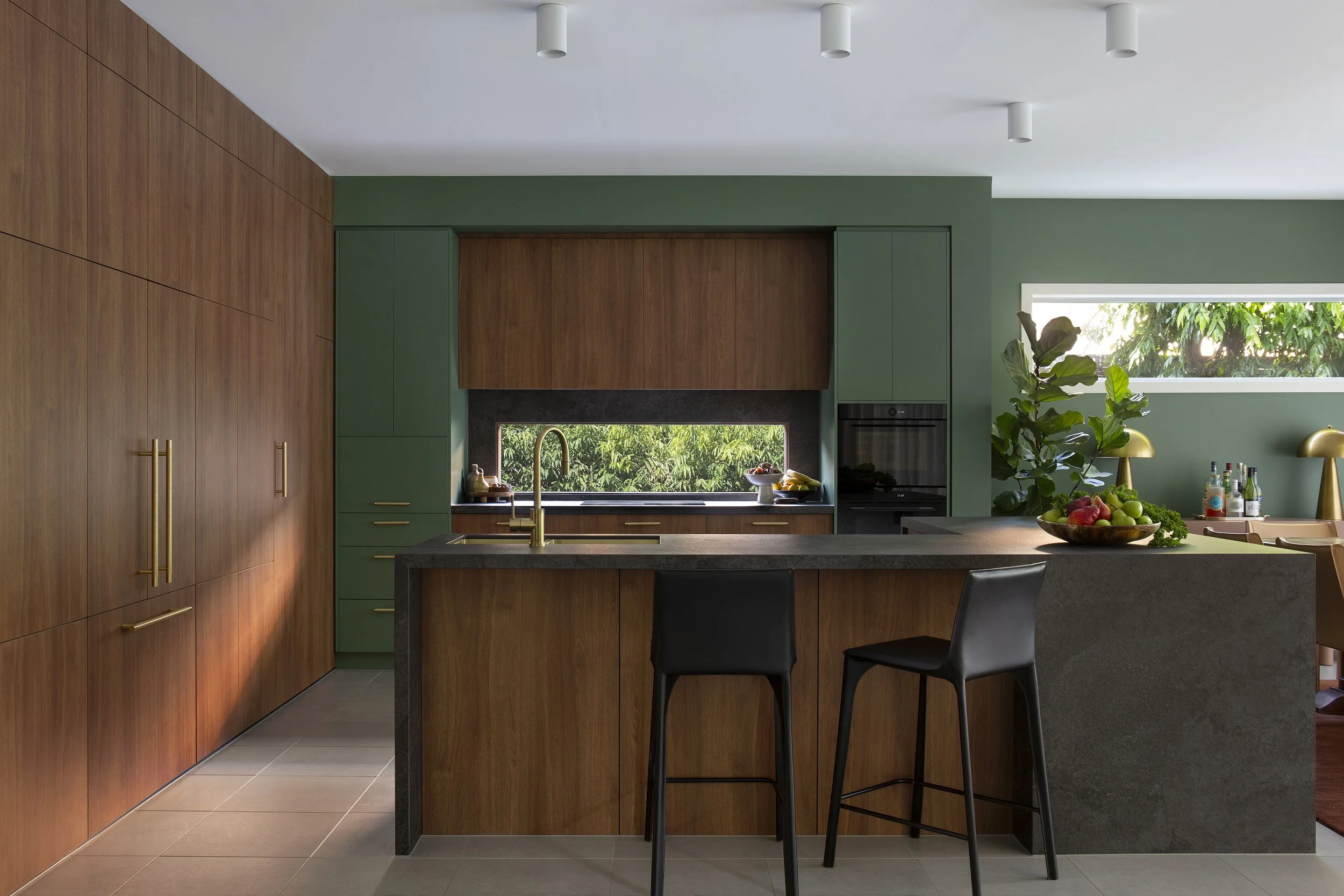
Utilising the existing layout, expansive use of walnut veneer paneling was used to create the feeling of a truly bespoke, high spec kitchen.
A Metricon Glow-Up
In the early 2000s, Metricon homes were the epitome of family living. These spacious but conservatively designed houses provided flexible living for countless young families so it’s no wonder they dotted the suburbs of Melbourne in abundance. One such dot, a two-story, four-bedroom, three-bathroom off-the-rack home located in leafy Malvern East, had been a beloved haven for two decades. But as the years passed and the children grew up, the home began to show the ravages age at the hands of 3 active kids. It was time for a refresh—one that would reflect the family's journey from the happy chaos of youth to a more refined, adult elegance.
The Client's Vision
The family wanted to breathe new life into their home, transforming it into a sophisticated and stylish space. Tired of the original safe beige palette a more mature and dynamic aesthetic was the goal. Their brief to DMP Creative was simple yet ambitious: create a home that felt grown-up, using colour and texture to inject sophistication whilst maintaining character and warmth.

Initial concept moodbaord. Warm hues and natural textures formed the overall creative direction.
Design Inspiration: Mid-Century Meets 1970’s Eltham
DMP Creative drew inspiration from American mid-century architecture and the distinctive designs of Alistair Knox, a renowned architect known for his work in Eltham during the 1960s and 70s. Knox’s designs were celebrated for their earthy materials and harmony with the natural environment often using expanses of rustic mud brick and reclaimed materials. This approach perfectly aligned with the family’s desire for a home that felt both sophisticated but relaxed enough to host many functions from 18th birthday parties to large family Christmases.

Rough, rustic tiles surround the newly created fireplace designed to invoke the use of hand crafted brick by celebrated architect Alistair Knox.
The Transformation
With the help of Ardele Construction, DMP Creative set out to bring this vision to life by incorporating a rich palette of materials and colors. Key elements of the renovation included:
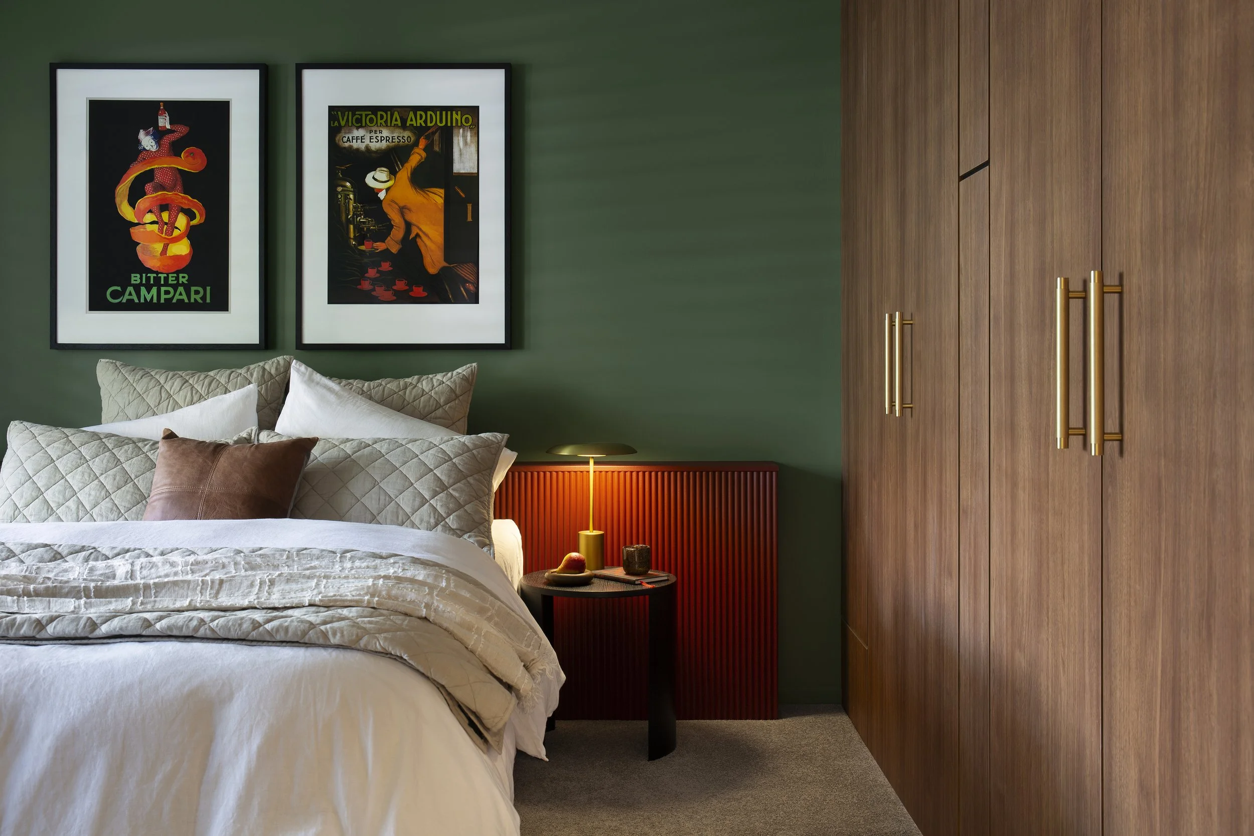
Warm Walnut Veneer: The extensive use of warm walnut veneer paneling added a sense of minimalist elegance and natural beauty to the home. This material was chosen for its rich, warm hues and was used on mass to create a feeling of refined earthy luxury.
Micro Cement: Micro cement was used to create sleek, contemporary surfaces in most bathrooms that were both durable & visually striking whilst being kind to the wallet. Its smooth, seamless finish provided a modern contrast to the natural textures of the other materials.
Earthy Green Paint Tones: Earthy green tones were employed throughout the home to evoke a sense of calm and connection to nature. These hues complemented the walnut veneer beautifully, creating a cohesive and inviting atmosphere. Pops of rusty red and orange were deployed to add a spicy contrast; a world away from Metricon’s “safety beige”.
Textured Brick Effect Tiles: Textured brick effect tiles were used in the family room to add depth and rustic charm, providing a tactile contrast to the highly refined walnut veneer surfaces. These tiles drew inspiration from Knox’s signature use of mud brick and recycled materials, blending rustic techniques with modern design.
Brushed Brass Accents: Highly refined brushed brass accents were strategically placed to add a touch of luxury and sophistication. These elements provided a polished counterpoint to the earthy materials, ensuring the overall design felt balanced.
Creating Impact with Rich Colours and Furnishings
To stay within budget while achieving maximum impact, DMP Creative used rich colors in both the design and furnishings. Bold, deep hues were chosen for walls whilst key pieces of artwork, decorative accents and furniture pieces also got the colour treatment with tactile but durable materials such as velvet, distressed leather and linen. This approach allows the family to imprint a new history without being precious of the new whilst infusing the home with high impact design vibrancy sans extensive structural changes.
The guest bedroom again uses expanses of walnut paneling to create a concealed wardrobe and entry into the adjoining ensuite.
The end result
The transformation of this early 2000s Metricon home shows how thoughtful design can breathe new life into a tired space without breaking the bank. By embracing rich colors, varied textures, and timeless materials, DMP Creative created a sophisticated, grown-up sanctuary that perfectly reflects the evolution of its residents. This rejuvenated home is now a beautiful, warm, and inviting space that stands as a testament to the family's journey and the power of inspired design.


Quote Like A Pro: How to get your renovation quoted and choose the right builder
Rightly or wrongly, getting building quotes and appointing a builder is a massive source of anxiety for a lot of people. And fair enough, media is awash with horror stories of dodgy builders doing remarkably dodgy things. But here’s a few easy tips to help you accurately quote and assign a builder to your next renovation of home build.

In the interior design business, there’s a saying “you kiss a lot of frogs until you find your prince”. And by prince, we mean builder. Sure, the allure of getting repeat business from an interior designer or architect is exceptional motivation to do an extra special job, as professionals, we still meet our fair share frogs along the way. Rightly or wrongly, getting building quotes and appointing a builder is a massive source of anxiety for a lot of people. And fair enough, media is awash with horror stories of dodgy builders doing remarkably dodgy things.
Over the years I’ve sifted out the good, the bad and the ugly and settled with a handful of builders I use on the reg. I trust them and they are simply awesome people who care about their craft and their clients…and their designer (most importantly, obviously). I’ll always invite them to tender for my projects and I know whichever the client chooses, we’re in safe hands.
“Righto, but I’m not an interior designer who does this all time” I hear you mumble. True, but there’s a few commonalties each of my trusted builders posses which I shall share with you right now so you can stop kissing frogs and find your own prince of construction and get your project confidently priced and underway!
Can I take your order?
know that urgent, unsettled feeling you get when the waiter is poised to take your order but you’re still frantically sizing up the menu? Then times this by 1000 if you haven’t fully locked in the design or plans or have a fairly good, documented idea of what you want to do. To get the most accurate quote, the builder needs to know what they’re going to be doing. And the more detailed you can be the better. Having a fixtures and fittings schedule (FFE), detailed proposed materials schedule, an electrical plan and a project scope of works are all critical details the builder needs to know. Of course, some smaller things are likely to change as the project progresses, but a solid plan of attack means you’ll get a more accurate quote and less fiscal freakouts down the track.
Reference point.
If a friend recommends a builder, you’re on a winner. Ask friends and colleagues if they have any personal recommendations. The better their experience was, the more they’ll swoon and that is the best reassurance you can get. As industry professionals, this is something my colleagues and I do. We’re the first to pass on builder details to a fellow designer if they’re awesome. If your mates come up blank, nothing wrong with reaching out to local interior designers and asking for advice. Typically, we’re all tragic people pleasers and love to support our beloved builders and trades with positive referrals. Of course, some builders are suited to certain types of projects so always check your project is vaguely similar to the type of projects the referred builder does. If not, reach out to them anyway as they may refer you to someone they know if they’re not suitable. It goes without saying, obvs stalk them all on socials to check out their previous work and reviews.

Speed Dating.
It’s always great to get 3-5 quotes on the same plans (so you’re comparing oranges with oranges). This quickly reveals who’s cheap and nasty, who’s being bougie and who is fair and reasonable. I tend to only get 2-3 quotes these days as I know my guys well and know they’re not price gauging. This is also a good opportunity to meet the teams and get a feel for them personally. You want to want to work with them and trusting your gut instinct here is so often undervalued in the equation.
You buy?
Quoting a build project is a tricky, involved science and it does take a builder a few weeks (if not longer) to put together a proper quote. Patience is key. I wouldn’t go as far as to say the longer you wait, the more accurate it will be, but I’m not far off. A builder who comes back to you in a few days has either loaded the quote with “just in case” slush or may present a gazillion surprise variations throughout the build. Be sure to check if the quote includes things like council permits, rubbish removal, project management, and procurement of FFE. In other words, what is and isn’t included. Feel free to ask for a more specific breakdown of costs if the quote was a little vague.
Timing your engagement is the surprise consideration. If you quote too early, you run the risk of price increases on materials, specified products being discontinued and requiring reselection and general exciting Wall Street global market type fluctuations. Quoting when you’re ready to get started means the information remains current. Don’t be fooled into thinking fixed price is better. See below.

Street Cred.
Always check your builder is registered with the appropriate industry bodies and holds the right insurance. Always worth asking if sub-contracted trades also have the same safe guards and will be able to provide certified compliance of works done. A great builder will do this for you.
A lot of the financial dramas in the building sector has been born from fixed price contracts falling victim to covid era hiccups to supply chains both in materials and labour. For me personally, I think it’s unreasonable to expect a fixed price for something so complicated which could unearth any number of nasty surprises (especially when renovating an existing, older property). In my opinion, a detailed quote and banking on a reasonable contingency fund for unexpected works is the fairest way forward for all stakeholders. Sure, no one wants to spend money on something so blisteringly tedious as rising damp, and your builder especially doesn’t want to. It’s your house after all.
In closing, your Honour…
By no means is this an exhaustive list of pitfalls to watch out for when starting your renovating or building project. But, hopefully it provides enough info to calm your farm and guide you towards further resources and some questions to raise with your builders before locking them in. A good place for further information is Consumer Affairs Victoria (or your state’s equivalent if not located in Vic). And of course, your friendly neighbourhood designer is always there to help.
Happy building!